LONG BEACH REDESIGN
THE PROJECT
Redesign a government website that needs an update and create a responsive web design (RWD) for both desktop and mobile applications. My role is both Researcher and Designer.
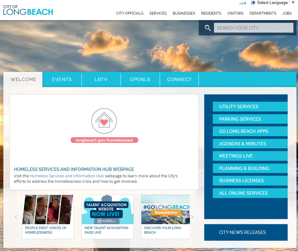
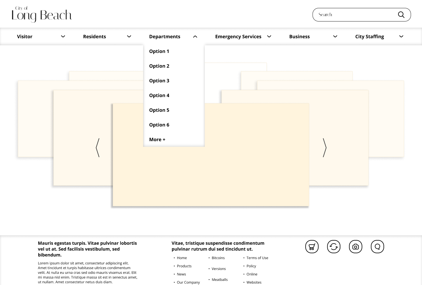
Original Long Beach City Website
THE PROBLEM
Residents and visitors who use the LongBeach.gov website often feel lost and overwhelmed due to the confusing navigation bar and text-heavy pages. This make the experiences more difficult to find what they are looking for, doubling the time it takes to locate information.
THE SOLUTION
Data collected from user testing revealed that residents and visitors want a simpler and cleaner site with a clearer navigation bar, enabling them to find what they are looking for more easily.
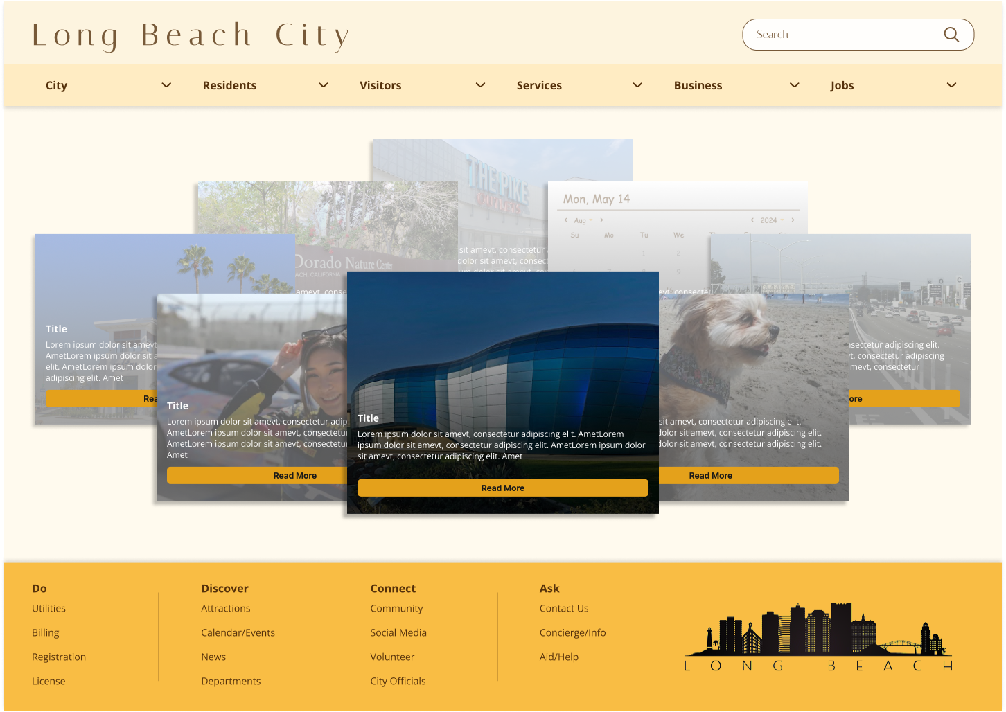
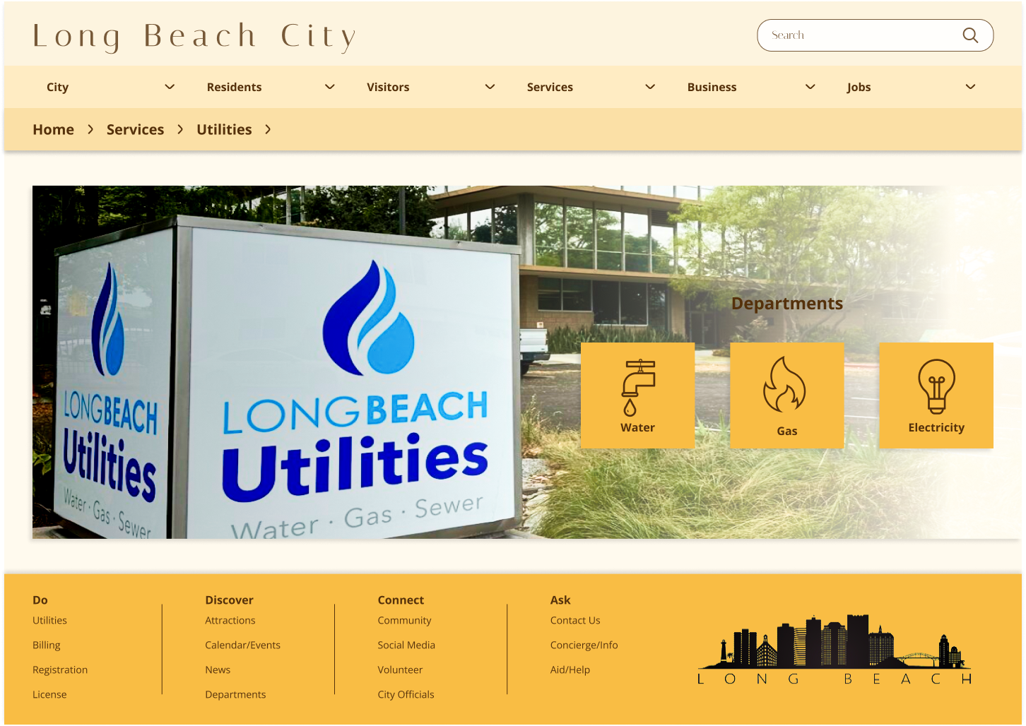
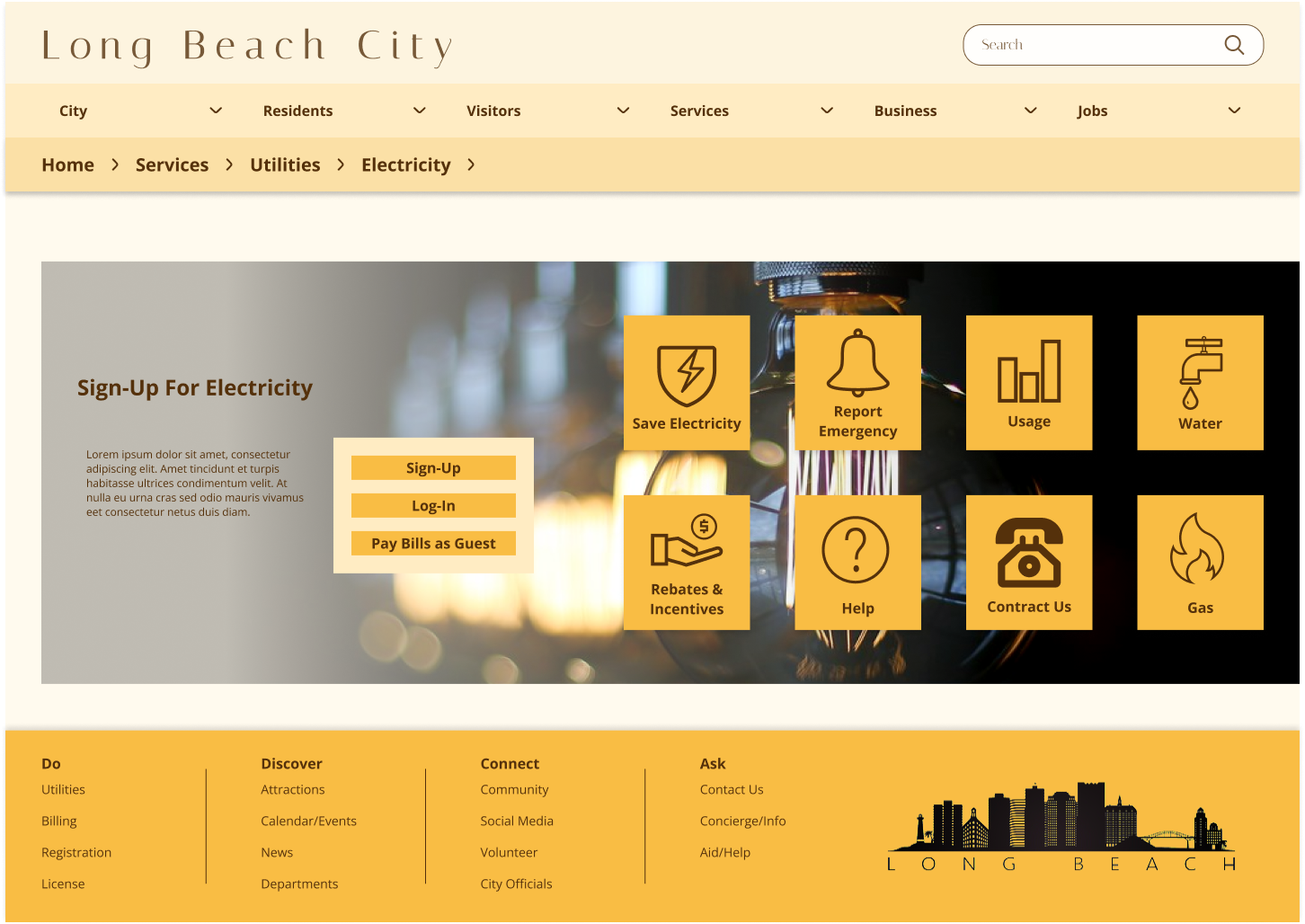
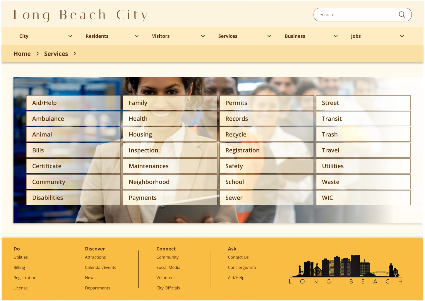
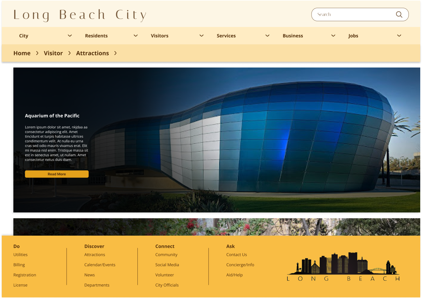
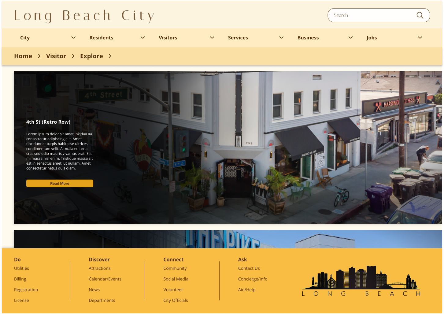
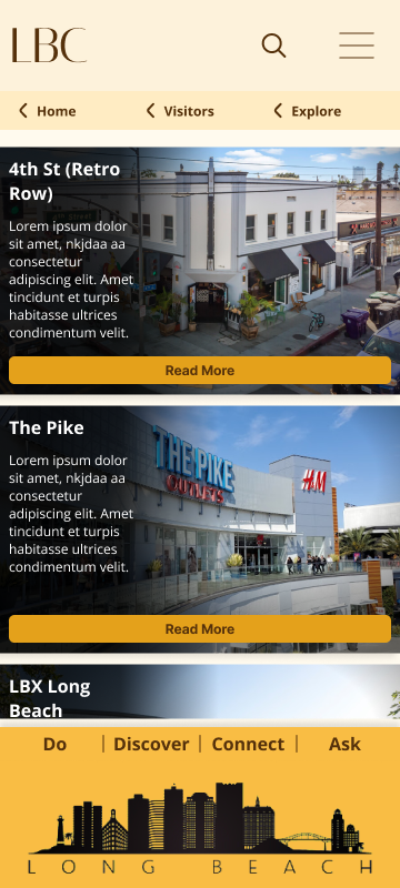
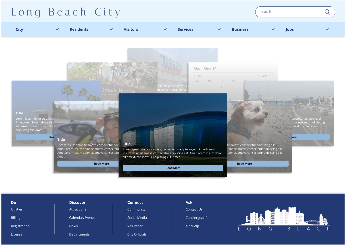
Redesign for Long Beach City Website
RESEARCH
I conducted user testing on the Long Beach government site to evaluate whether users could complete a few assigned tasks. The results showed that users faced significant difficulties navigating the categories within the navigation bar. When they couldn’t find what they needed, they resorted to using the search bar, which also proved confusing due to the unclear results. Based on this data, I prioritized restructuring the navigation bar first. Next, I planned to revise and simplify the site’s visual design.
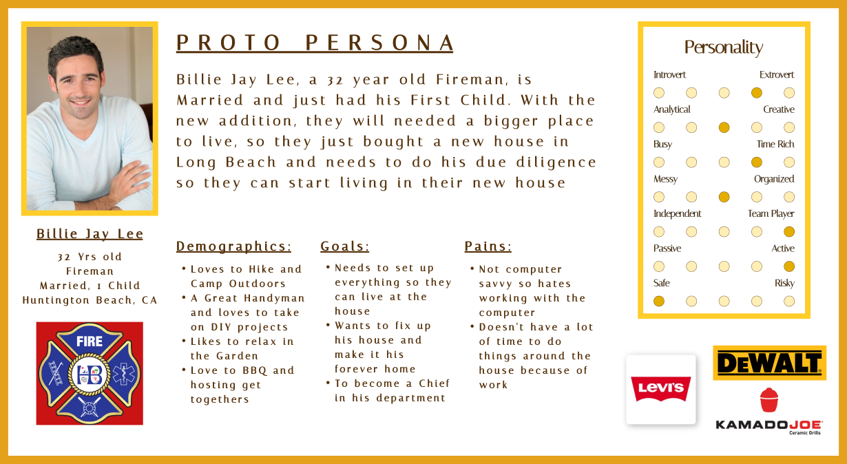
PROTO PERSONA
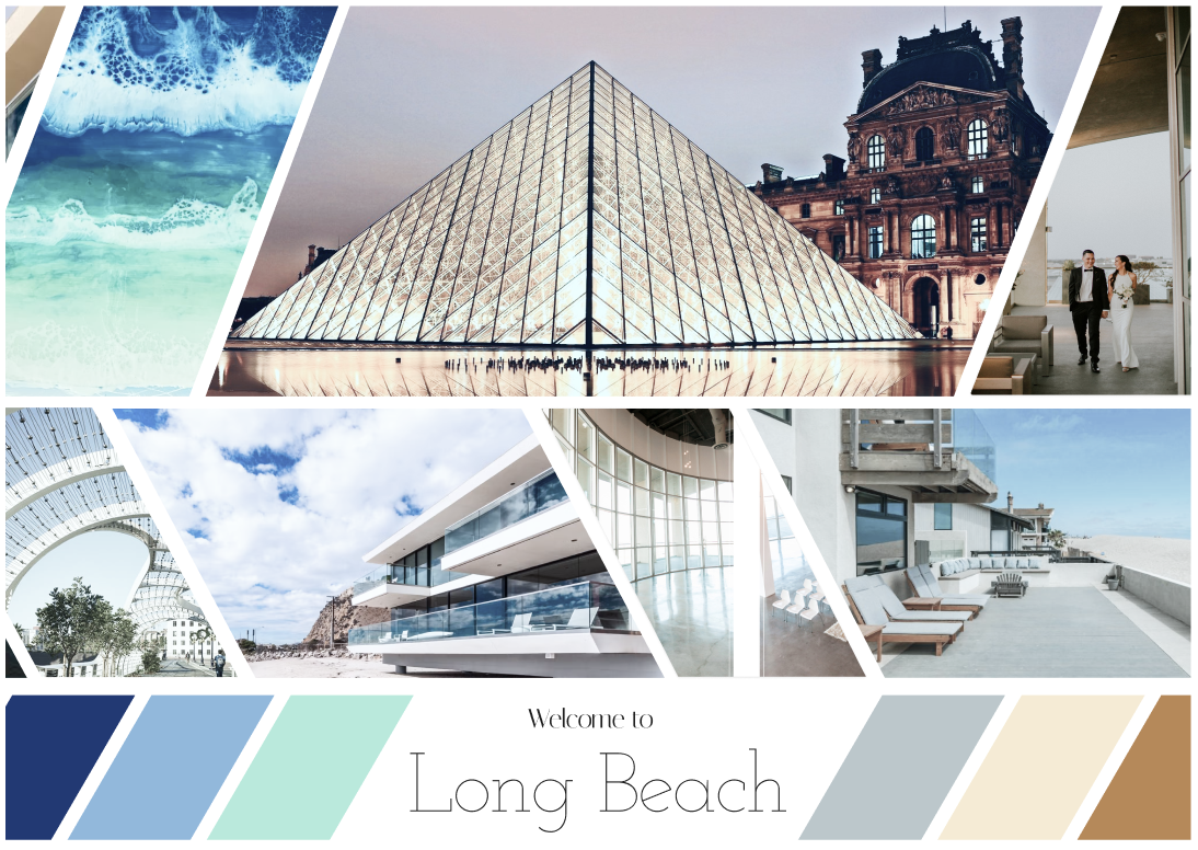
MOODBOARD
USER TESTING - PLAN
Objective:
Observe how users navigate the Long Beach government site and assess their ability to complete specific tasks.
Task:
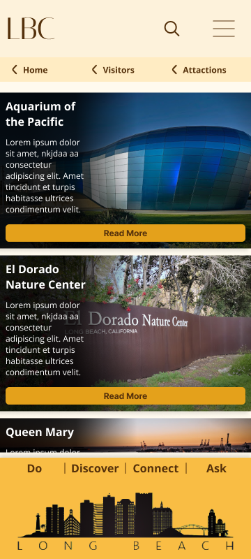
- Explore Attractions: It’s your first time visiting Long Beach, and you want to find something fun to do. Navigate through the LBC website and find a few activities you’d like to try, such as shopping, events, or attractions.
- Organize a Garage Sale: Imagine you’re cleaning out your garage and have a lot of items to get rid of. First, find information on how to hold a garage sale in Long Beach by navigating the website. Then, find a place where you can donate any unsold items.
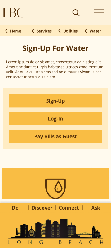
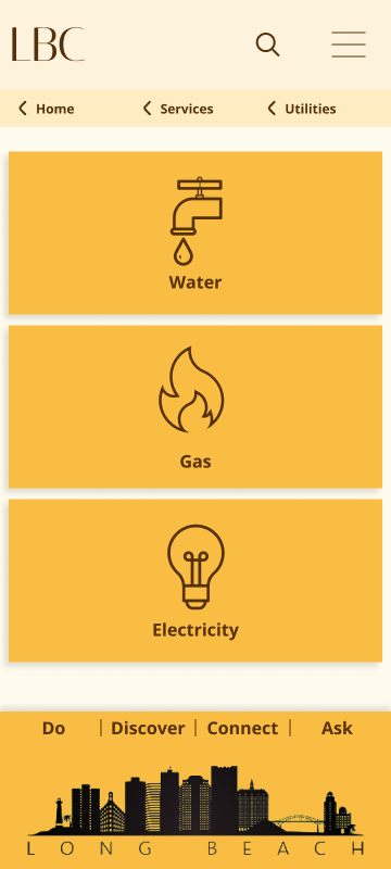
- Set Up Utilities: You’ve just purchased a new house in Long Beach and need to set up water, gas, and electricity services. Navigate the website to find the information and steps necessary to set up all three utilities.
USER TESTING - RESULTS
Task:
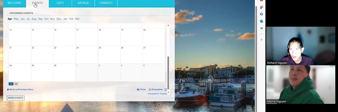
- Explore Attractions: All users found this task easy. They primarily navigated through the Events tab in the front “Hero” window. The top navigation bar was their second choice.
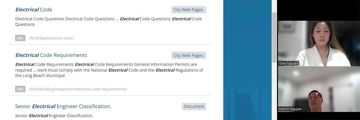
- Organize a Garage Sale: This task was more challenging for users. They had difficulty identifying the correct category to navigate to and ultimately resorted to using the search tool. One user, in particular, relied solely on the search tool, knowing there were too many options to sift through.
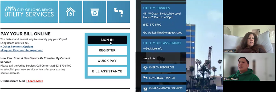
- Set Up Utilities: All users were able to complete this task, but they encountered issues due to the overwhelming amount of text. They expressed a desire for a button at the beginning to set up all three utilities. Finding information on electricity was particularly difficult because it involved an external company with a small, hard-to-find link.
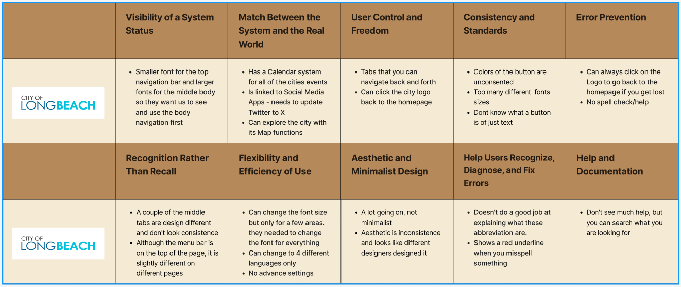
HEURISTIC EVALUATION - WEBSITE
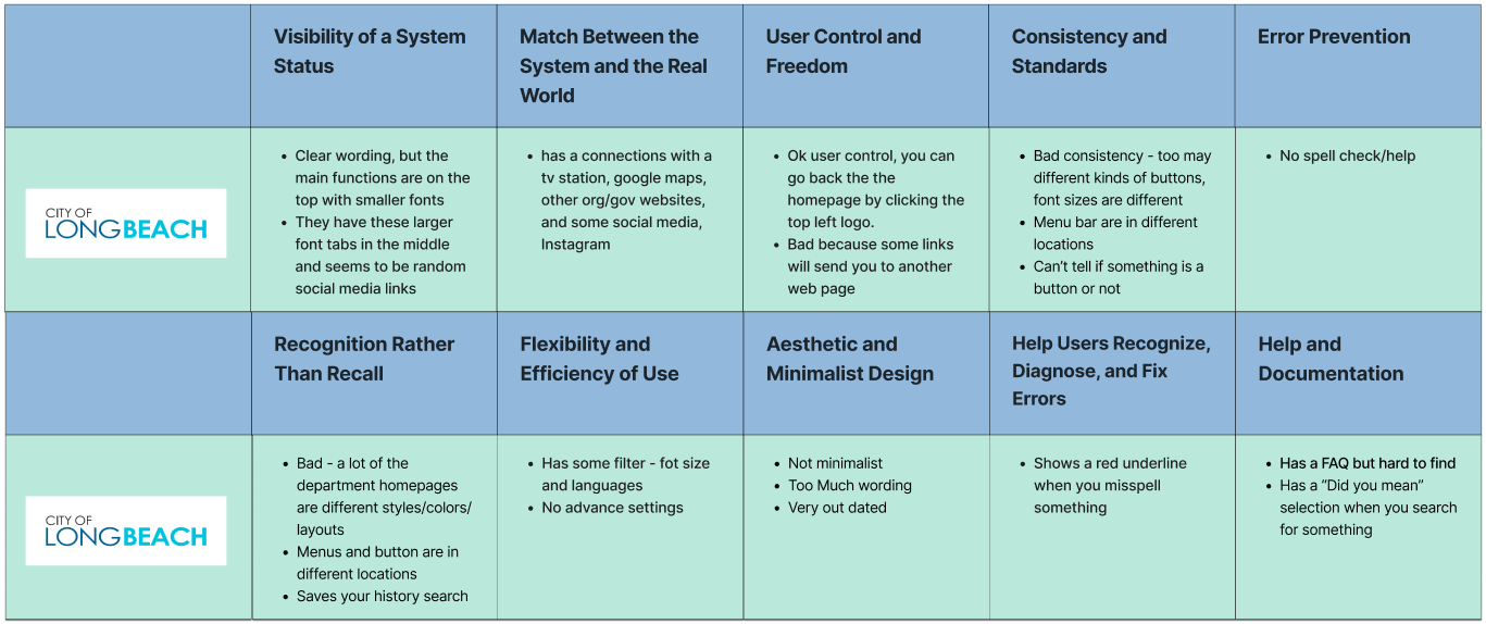
Annotations

Annotations
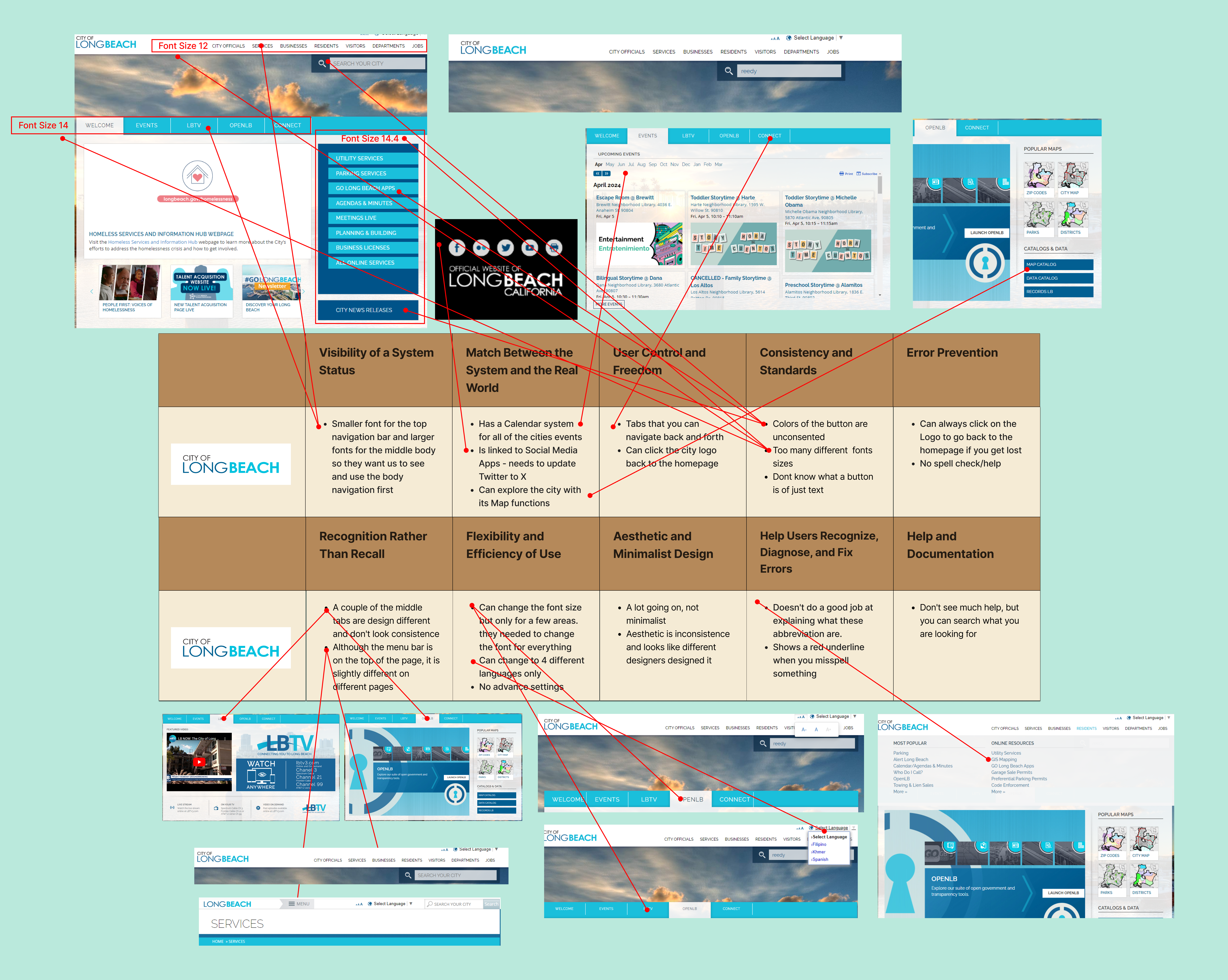
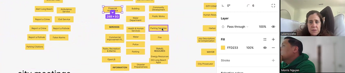
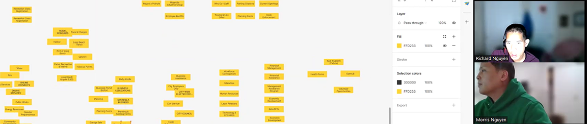
HEURISTIC EVALUATION - NAVIGATION
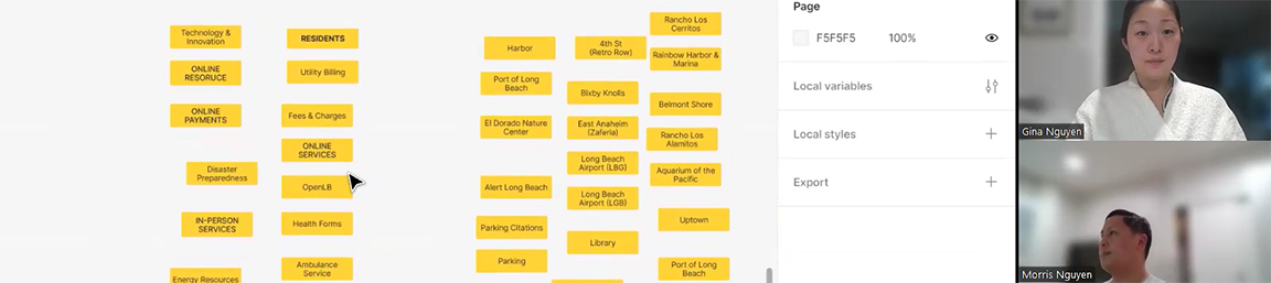
CARD SORTING
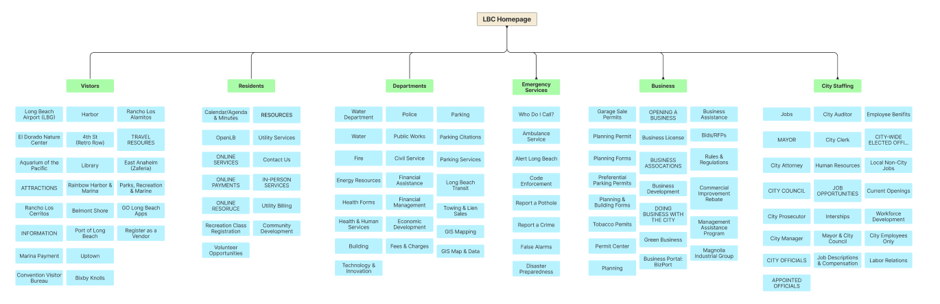
CARD SORTING - RESULTS
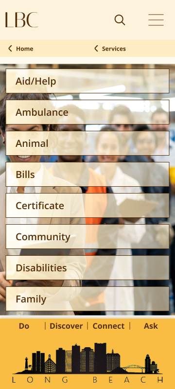
All users felt overwhelmed by the numerous subjects/cards on the government site, which took them a while to sort through. Some cards were unclear, leading users to guess their appropriate categories.
- User #1: Unable to categorize some cards, labeled them as “Other Services.”
- User #2: Consolidated cards into as few categories as possible.
- User #3: Created many categories, resulting in an extensive list.
Overall, most categories created by users were similar, though some had different titles despite having similar meanings.
PROTOTYPING
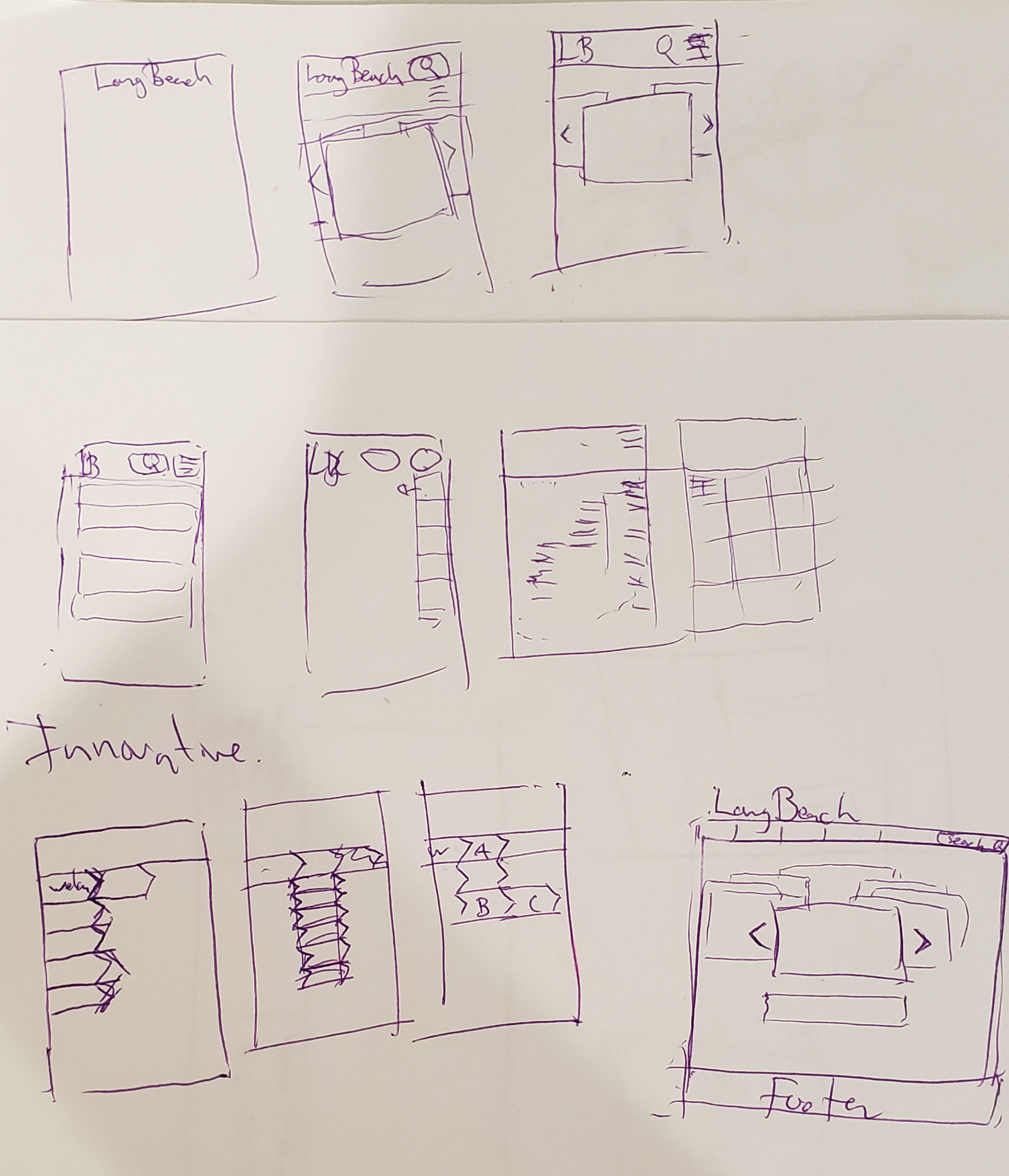
Paper
Lo-Fi Wireframe
Lo-Fi Wireframe
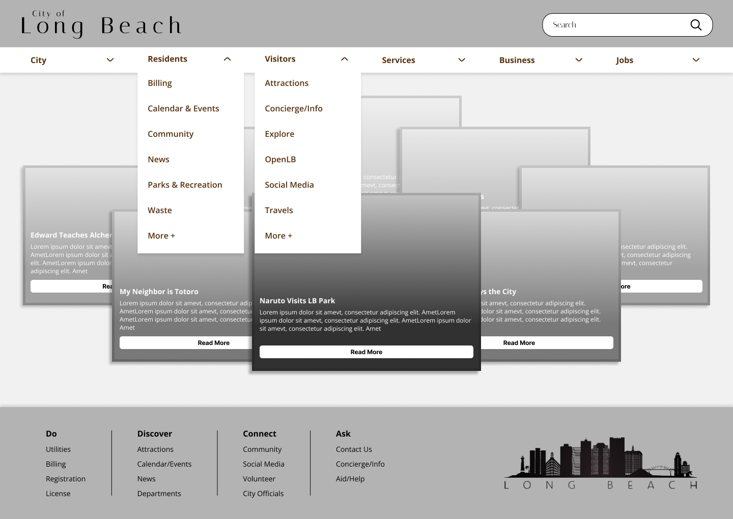
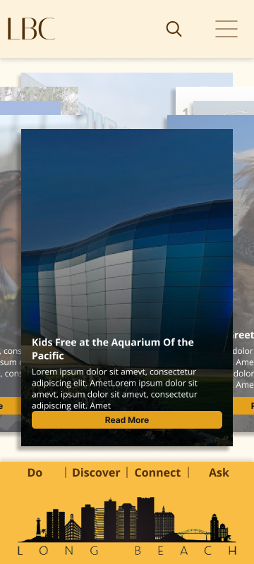
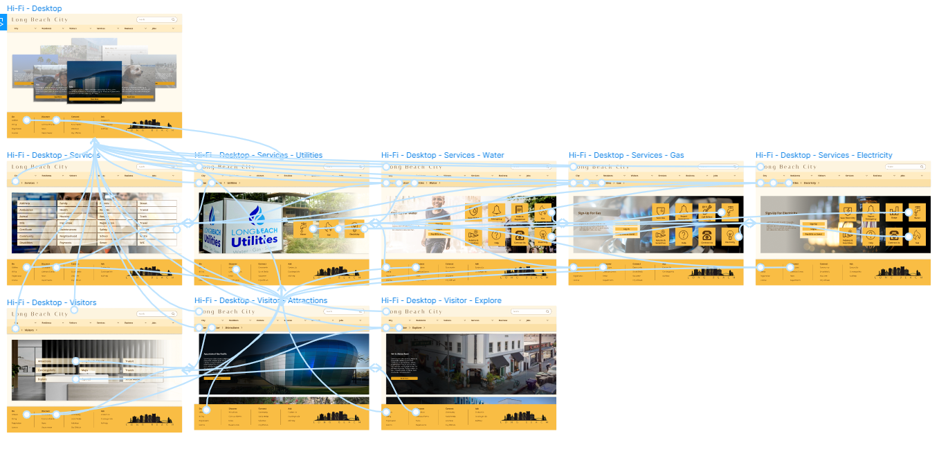
HI-FI PROTOTYPING - WEBSITE (RWD)
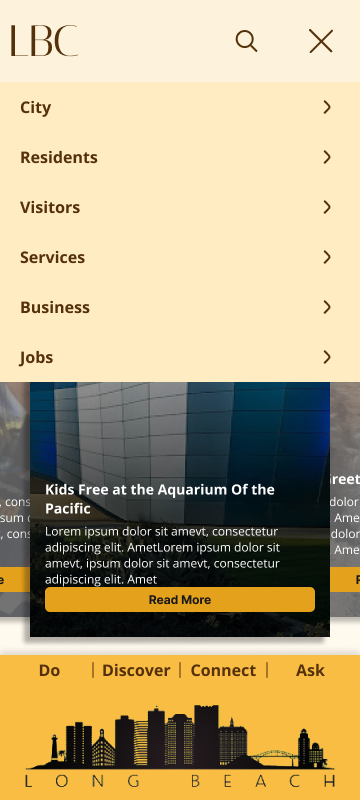
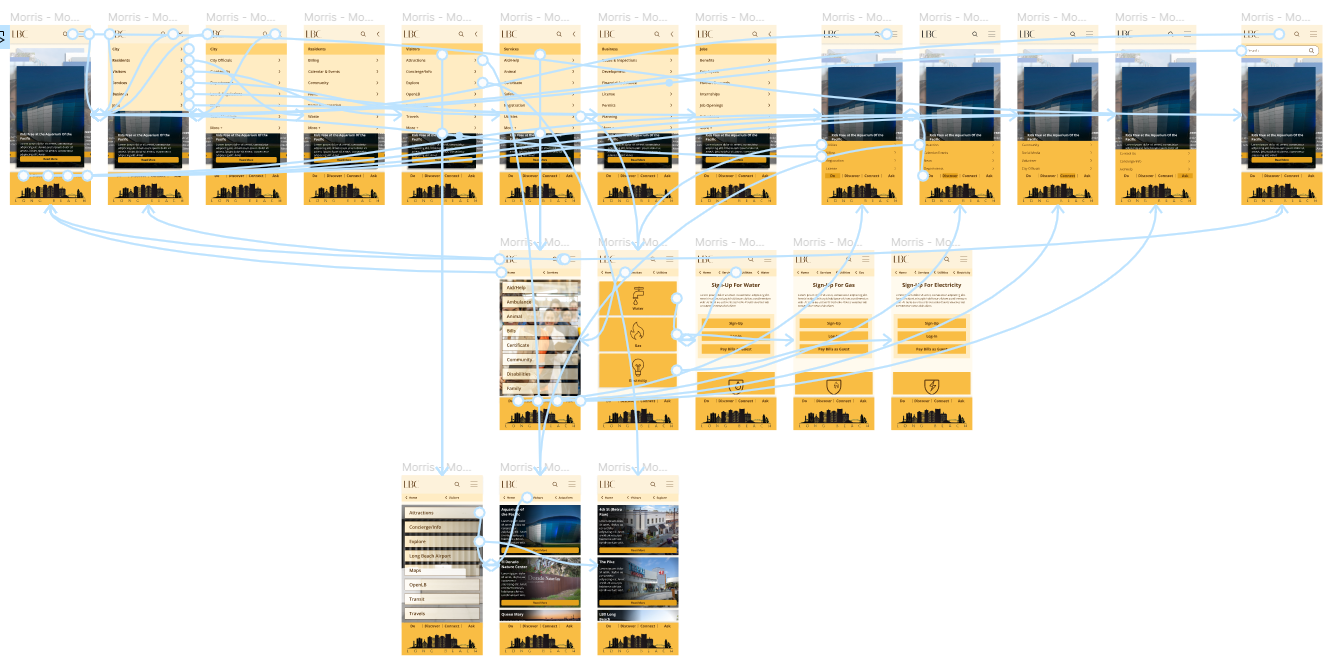
HI-FI PROTOTYPING - MOBILE (RWD)
PROTOTYPING FLOW
Website Flow
Mobile Flow
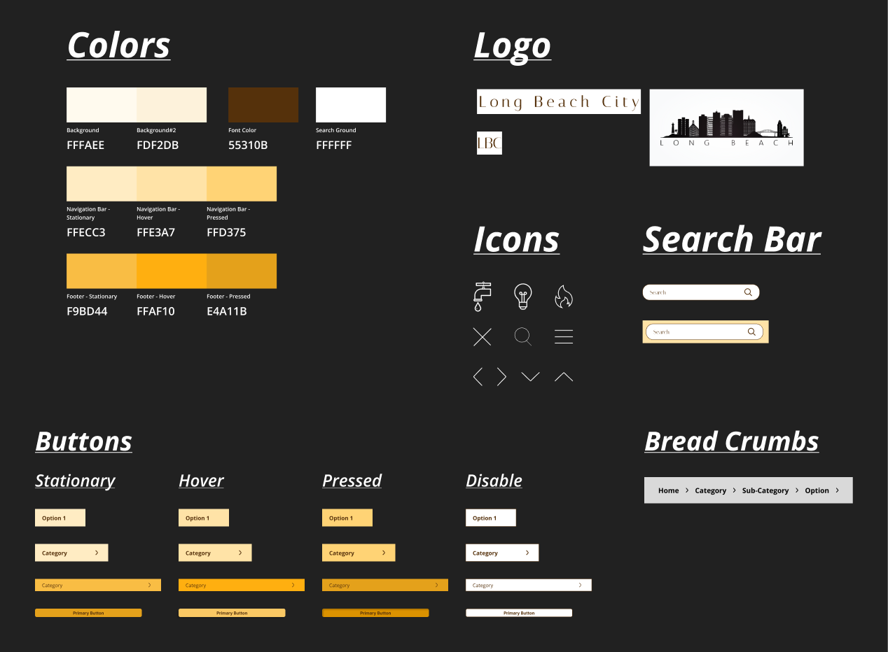
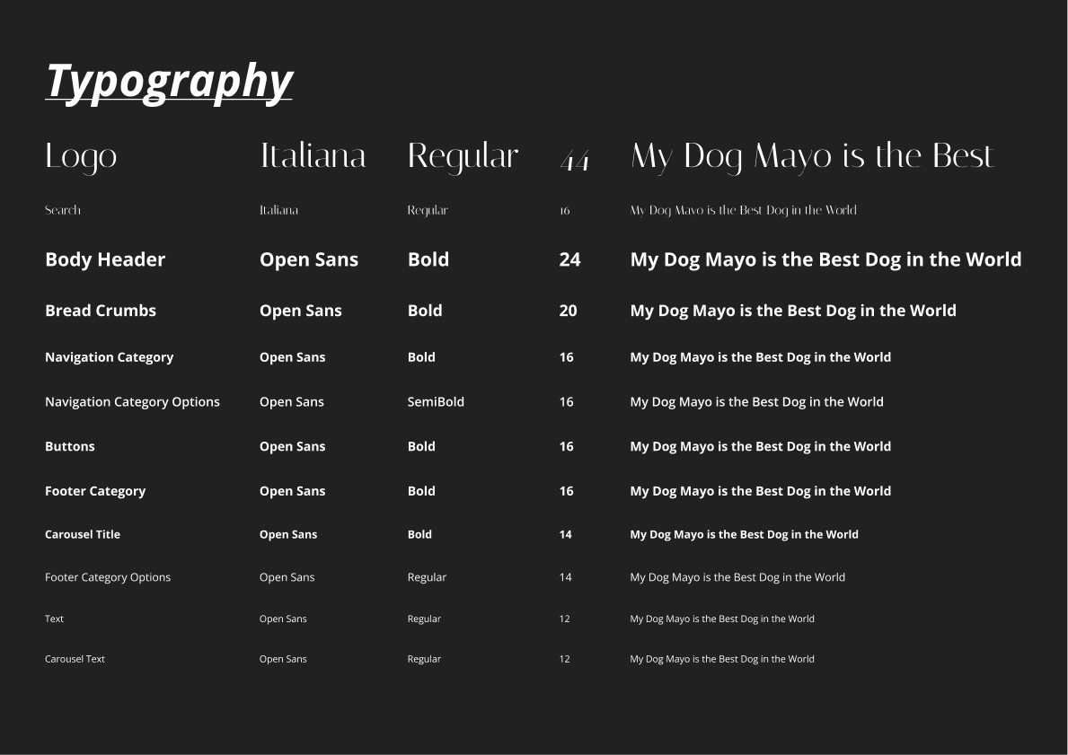
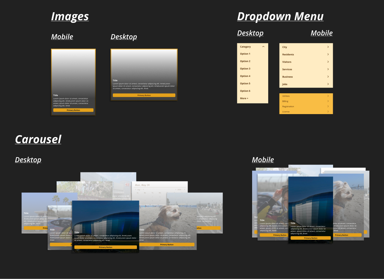
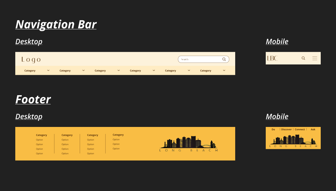
STYLE GUIDE
AB TESTING
My Thoughts:
After completing the high-fidelity prototype, I questioned whether the chosen color scheme was effective. To evaluate this, I created an alternative blue colorway and conducted A/B testing to compare the two options.
The Results:
3 out of 5 users preferred the blue colorway, as it evoked a more beachy feel compared to the yellow colorway. However, one user did not like the white logo on the bottom of the blue version. One user noted that the yellow and black color scheme is associated with Cal State Long Beach College. Given that the test did not provide a definitive answer, I have decided to retain the original colorway.
FINAL THOUGHTS
The Process:
As a resident of Long Beach, I encountered numerous issues with the current Long Beach website which prompt me to redesign it. The site was confusing and made it difficult to find information.. Through user testing, I discovered that many others experienced the same frustrations.
The Results:
Based on research and testing, I designed a cleaner and more minimal prototype. The new design aims to simplify user interactions by reducing heavy text and confusing links, directing them to the information they need.
The Future:
With more time, I would like to address additional issues identified during testing:
- Enhanced Search Engine: Users struggled with the current search engine, often having to sift through irrelevant results. I would optimize the search functionality to deliver more accurate results, reducing the time users spend searching.
- Streamlined Navigation Bar: Users found the navigation bar overwhelming due to its many options. I would consolidate these choices further to make navigation more intuitive and efficient.
- Improved Calendar System: I would develop a better calendar system that integrates with users’ devices and provides updates on current news and events, enhancing usability and keeping users informed.